Jump to section:
Corporate style
Why should you care?
Using corporate style correctly builds and reinforces our strong brand image.
The Blue Cross and Blue Shield symbols and names are among the most recognized in America. Americans associate those symbols with high-quality, affordable health care coverage. The brands also represent high-quality, customer-focused, innovative and cost-effective companies. Blue Cross and Blue Shield of Kansas (BCBSKS) has been a leader in our communities for almost 80 years.
We can build on this image in several ways. Some ways include producing letters, advertising copy, brochures, newsletters and more, that are consistently written and designed. All materials should be written with consistent use of words, punctuation and phrases when they represent any aspect of the business conducted by BCBSKS and its subsidiaries. In addition, all materials should be designed to reflect the graphic standards of both the Blue Cross Blue Shield Association and BCBSKS.
Does having a common style for the whole company really matter? Providing consistent, clear messages improves credibility, projects professionalism, enhances branding and sends a consistent image to the public. The company relies on all employees to communicate accurate messages to members and potential customers.
The following information was compiled by the marketing and experience division to provide a consistent reference source for use by all employees who write about our business.
The following resources were used to compile this information:
Associated Press Stylebook
The Gregg Reference Manual
Elements of Grammar
There are many aspects of grammar, spelling, punctuation and style that are not addressed in this guide. If you have a question or suggestion, please email [email protected].
Capitalization
In general, avoid unnecessary capitals. Use a capital letter only if you can justify it by one of the principles listed here. All of our printed materials, digital materials and most of our website copy will use sentence case. Title case is only to be used in the primary navigation of a website and the topmost blue bar of the BCBSKS website.
Sentence case: This is an example of sentence case.
Title case: This Is An Example Of Title Case.
Proper nouns: Capitalize nouns that constitute the unique identification for a specific person, place, or thing: John, Mary, America, Boston, England.
Some words, such as the examples just given, are always proper nouns. Some common nouns receive proper noun status when they are used as the name of a particular entity: General Electric, Gulf Oil.
Proper names: Capitalize common nouns such as party, river, street and west when they are an integral part of the full name for a person, place or thing: Democratic Party, Mississippi River, Fleet Street, West Virginia.
Lowercase the common noun elements of names in plural uses: the Democratic and Republican parties, Main and State streets, lakes Erie and Ontario.
Job titles: Capitalize job titles both when they come before the name as a proper title and when used after the name as a description of the person: President Dwight D. Eisenhower; Matt All, President/CEO.
Additional rules:
Titles
- Capitalize when using title before name: Vice President Bob Jones.
- Use lowercase when using title without name: The vice president stood.
- Capitalize when title follows name: Jane Doe, Vice President.
- Use lower case for job descriptions.
Departments, Divisions, committees
- Capitalize all department and division names at Blue Cross and Blue Shield of Kansas: Administrative Services, Corporate Communications, etc.
- Capitalize government departments: the Treasury Department.
- Capitalize proper committee names: Guiding Coalition, Steering Committee
Company names and terms
The following is a list of company names and related terms that serve as reference to how they should be written across all publications.
For additional terms, please reference the corporate glossary or providers glossary.
Advance Insurance Company of Kansas: AICK is acceptable on second reference.
Administrative Services of Kansas: ASK is acceptable on second reference.
Blue Cross and Blue Shield of Kansas: Always spell out our name on first reference. "BCBSKS" or "Blue Cross" are acceptable on second reference.
Blue365®: One word. The registered trademark should be present with first use. It does not need to be used on additional mentions.
BlueAccess®: One word. The registered trademark should be present with first use. It does not need to be used on additional mentions.
Coinsurance: Always one word, no hyphen
Company: This term can be used interchangeably with "organization" when speaking to outside audiences (non-BCBSKS employees)
Copay/copayment: Always one word, no hyphen
Health care: Always use "health care" as two words, not one.
HealthyOptions: Always one word
GeoBlue®: One word. The registered trademark should be present with first use. It does not need to be used on additional mentions.
Groups: This term should be used when speaking with internal employees.
Level-funded: Always one word, with a hyphen
Marketplace (healthcare.gov): First reference
National Walk@Lunch Day: No spaces on either side of @
Organization: This term can be used interchangeably with "company" when speaking to outside audiences (non-BCBSKS employees)
Plan 65: Always two words
Preventative/preventive: Always use "preventive"
Secure 300 Cancer PlanSM: Secure 300 is acceptable on second reference. The service mark is only needed on first use.
Secure Hospital Indemnity PlanSM: S-HIP is acceptable on second reference. The service mark is only needed on first use.
Value-based: Always one word, with a hyphen
Well-being: Always one word, with a hyphen
Correct way to refer to company in text
The Blue Cross Blue Shield Association (BCBSA) has developed a stringent set of guidelines to help all licensees protect the integrity of these well-recognized symbols and signature. As an independent licensee of the Association, Blue Cross and Blue Shield of Kansas is required to comply with these guidelines on all internal and external materials.
For more information on graphic standards and placement, email [email protected]. For information on legal issues concerning the brands, please email legal services.
- “Blue Cross and Blue Shield” may be followed only by “Plan(s),” “organization(s),” “Association” or “of geography,” (for us “of Kansas”).
- Do not use “Blue Cross and Blue Shield” followed immediately by common nouns, such as “employees,” “buildings,” etc. The phrase “of Kansas” must be included.
- It is permissible to refer to “the Kansas company” or “the company” if the full name has been previously given in the copy. Also, “BCBSKS” or “Blue Cross” are acceptable on second reference, however, “BCBSKS” is preferred.
Blue Cross and Blue Shield of Kansas should always be used on first reference. On second reference, “BCBSKS,” “Blue Cross” or “the company” is acceptable because it is being used to refer to the name of the company. - Never use the term “Cross and Shield” without placing the word “Blue” before each word.
DO:
Blue Cross and Blue Shield of Kansas
DON’T:
Blue Cross Blue Shield of Kansas
Blue Cross/Blue Shield of Kansas
Kansas Blue Cross and Blue Shield
BC/BS of Kansas
BlueCross and BlueShield of Kansas
DO NOT USE AN APOSTROPHE WITH ANY VERSION OF OUR NAME.
Do not use:
BCBSKS'
Blue Cross'
Blue Cross and Blue Shield of Kansas'
Directions for navigation
When giving directions about how to navigate a website, document, etc., italicize the text. Example: To find the EZ Scheduler link, from the homepage hover your mouse over the Life tab and click on Employee Well-being.
Font guidelines
Core brand fonts for marketing materials are Mencken STD Extra Bold and Univers 57 Condensed. Most BCBSKS departments do not have access to Mencken or Univers, please use the following fonts for letters, documents, emails and PowerPoint presentations.
- Letterhead body text font: Georgia. Departments communicating directly with members may use Arial for written correspondence.
- PowerPoint fonts: Georgia Bold and Arial Narrow. These fonts are already built into the template.
- Email font: Aptos. This font should already be your default email font. See the email signature section above if you still need to add the standard company email signature to your email correspondence. If using CT Suite for correspondence, use a default font such as Calibri.
All correspondence must be at least 11-point font or larger. The Centers for Medicare and Medicaid Services and the Kansas Insurance Department regulates that all letters and solicitation materials must be 12-point font or larger for our senior market (ages 65 and older).
Letter formatting guidelines
- Corporate letterhead should always be used in professional correspondence.
- AICK or ASK letterhead is required for subsidiary correspondence.
- Use Georgia for letters. Departments communicating directly with members may use Arial for written correspondence.
- Left justified format is preferred.
- The left margin should line up under the far-left side of the logo at the top of the letterhead.
- The right margin should line up with the far-right side of the logo.
- Code numbers, salutations or addresses should never be printed above letterhead logos/header.
- If the letter is more than one page, letterhead should be used for the first page only. Subsequent pages should reference the previous pages.
- Sentences should never appear in all capital letters. Capital letters are difficult to read. Minimize the use of capital letters whenever possible. You may use all caps for acronyms and abbreviations (as needed).
- Use bold rather than all capital letters to make words or phrases stand out. Reserve bold for important phrases or keywords.
- Underline bold words sparingly.
- Only use italics to emphasize or highlight quotes, names of publications and conversations.
- Official correspondence should always be copied on white paper. Colored paper limits readability and causes distortion.
- If you would like to share a letter (that's on our letterhead) with one of your contacts, please export your Word document to a PDF, then attach the PDF to an email. That way your contact can print or save the letter more easily.
- Never double space after any punctuation. Always use a single space.
Logo (primary)
Putting Kansas first
With our new design system, we’re going all-in on Kansas — focusing on our commitment to the health of our neighbors, our communities and our state. That’s why we’re flipping the hierarchy of our wordmark to lead with what truly sets us apart: our longstanding, local roots.

Our primary logo
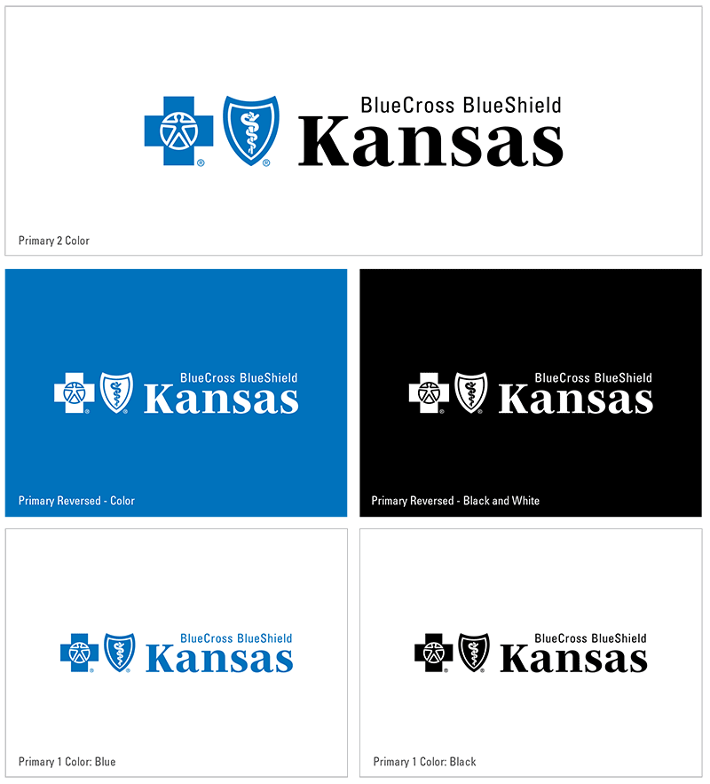
Our logo has two required elements: our symbols and our name. All internal and external Blue Cross branded marketing communications must use our logo and adhere to the following rules:
- The signature may appear in a single, clearly defined configuration only as shown in the accompanying examples.
- The logo must appear in a single, clearly defined configuration as shown in the accompanying examples.
- Never attempt to create your own version of the logo — only use the officially prepared electronic logo artwork, which you can obtain from our logo library.
- The two-color logo must combine the symbols in Pantone® 300 (Blue Cross Blue) with the type in black. To account for printing limitations, the Blue Cross Blue Shield Association has developed three acceptable alternative treatments, shown in the examples.
- If Blue Cross Blue isn’t feasible, the appropriate process color build is acceptable.
Clear space
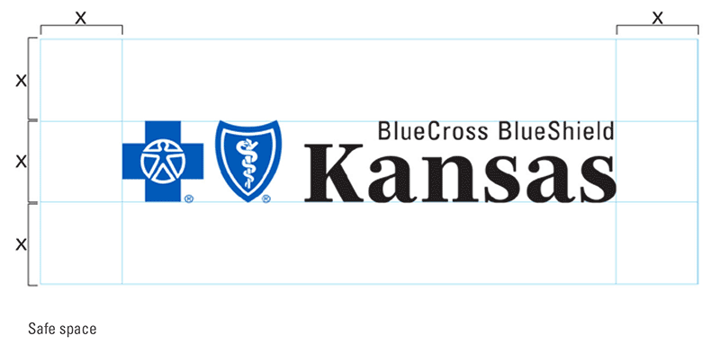
Always separate the logo from accompanying text and graphic elements with a minimum specified amount of clear space. You can determine the minimum amount of clear space needed by measuring the height of the Blue Cross symbol in the logo, represented by X in the example.
Minimum size
The minimum logo size for the primary mark is two inches wide. This rule protects the legibility and recognizability of our mark. The logo at right is set to scale and can serve as a visual reference to check for accurate scaling.
For scenarios that may require a smaller logo, please see our secondary or tertiary logo.

Licensee disclosure
Licensee disclosure is also a Blue Cross Blue Shield Association legal requirement. The statement can be placed anywhere on the piece. The type must be at least 6 point in size and must remain legible and relatively independent of other copy or graphics. The statement shown here, must be included whenever the company name is mentioned.
"Blue Cross and Blue Shield of Kansas is an independent licensee of the Blue Cross Blue Shield Association."
A shorter version of this disclosure is available but it only allowed when another entity is not named within the piece. See additional detail regarding co-branding in the next section. For more information regarding the shorter statement, please contact our brand creative team by emailing [email protected].
"An independent licensee of the Blue Cross Blue Shield Association." (Abbreviated version available for specific scenarios.)
Co-branding
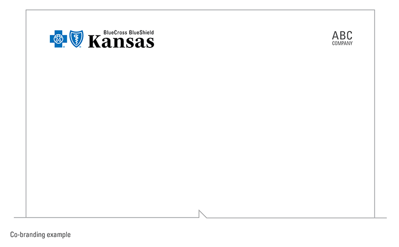
Co-branding is when the Blue Cross brand appears with another entity unrelated to our company. When co-branding occurs, a statement must appear with the full licensee disclosure that clearly explains the relationship that exists between Blue Cross and the other entity; for instance:
Blue Cross and Blue Shield of Kansas is an independent licensee of the Blue Cross Blue Shield Association.
BLUE CROSS®, BLUE SHIELD® and the Cross and Shield symbols are registered service marks of the Blue Cross Blue Shield Association, an association of independent Blue Cross and Blue Shield Plans. ABC Company provides vision services for our members and is not affiliated with Blue Cross and Blue Shield of Kansas.
In co-branding instances, the shortened or abbreviated licensee disclosures should not be used as mentioned above.
In addition to the disclosure, placement of the logos should be considered. The Blue Cross logo must appear more prominent than another entity’s logo. It should appear above or to the left of, and appear no smaller than, the other entity’s logo.
Improper usage
The primary logo should never be altered, recreated or stretched in any way. This includes placing our mark on backgrounds that hinder legibility or distort perception of the Blue Cross and Blue Shield of Kansas brand. Below are some examples of incorrect uses of the logo.
If you have questions regarding proper logo usage, please contact our brand creative team by emailing [email protected].

Logo (secondary)
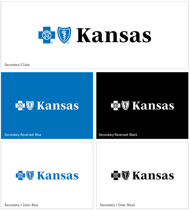
In scenarios that may not require our full wordmark, use the secondary logo.
Use the secondary logo if:
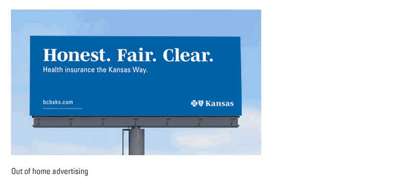
- The accompanying text reading ‘BlueCross BlueShield” may be illegible at scale. Examples include digital executions or out-of-home billboards
- The mark will appear on a screen for less than two seconds
- The primary mark appears elsewhere on the same piece of collateral
Adjustments
While similar to our primary logo, the secondary mark has some distinct differences that are worth noting:
- The size of the word "Kansas" is increased while the size of the Cross and Shield symbols remains the same.
- The word "Kansas" horizontally aligns with the internal shapes of the symbols.
- The overall mark is wider.
The safe space rules for the primary logo also apply to the secondary logo and licensee disclosure is still required.

Usage
Minimum size
With the removal of the text "Blue Cross Blue Shield" the secondary logo allows to decrease the scale below the minimum setting for the primary logo. To maintain legibility of the secondary mark, the minimum height allowed is .25 inches.

Digital
Use of the secondary logo may improve comprehension and legibility in digital spaces when compared to the primary logo. It is suitable for use when time is limited (social posts) or the audience is aware that it is our brand conveying the message (email).

Out-of-home
Due to the nature of how our audiences experience these placements, quick and concise comprehension is paramount. The secondary logo is our preferred mark when creating out-of-home advertising.
Logo (tertiary)
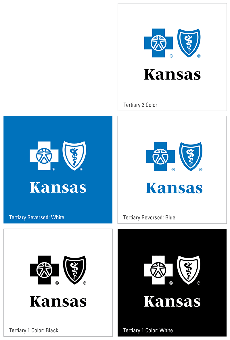
Some scenarios may be limited horizontally, for these cases utilize the stacked, tertiary logo.
To use the tertiary Blue Cross and Blue Shield of Kansas logo the following scenarios must apply:
- The horizontal space allowed for the logo is limited.
- The accompanying text reading "BlueCross BlueShield” may be illegible at scale or not a lot of time available to read the text. Examples include digital executions or out-of-home billboards.
- The mark will appear on a screen for less than two seconds.
- The primary mark appears elsewhere on the same piece of collateral.
Usage
Two color
For the closest visual connection to our core logo, utilize the two-color version as the preferred version of the tertiary mark.
Minimum size
With the removal of the text "Blue Cross Blue Shield" the secondary logo allows to decrease the scale below the minimum setting for the primary logo. To maintain legibility of the tertiary mark, the minimum width allowed is 1 inch.
Promotion and apparel
The secondary and tertiary logos are great options for promotional items and apparel. The simplified marks can allow for increased legibility on embroidered applications, cylindrical items (water bottles, pens) or scenarios where horizontal space is limited.
For more information regarding the tertiary logo, please contact our brand creative team by emailing [email protected].
Proper building and lot locations
Use Bldg. A, Bldg. B, Bldg. C, Bldg. K, etc.
Use Lot B, Lot L, etc.
Proper use of BCBSKS division names
These are the official names of the BCBSKS divisions. They should be capitalized in all instances.
- Executive Office
- Finance
- Human Resources and Administrative Services
- Operations and Government Programs
- Legal, Governance and Technology (LeGIT)
- Government and Community Relations
- Information Technology and Services
- Medical Affairs
- Sales, Experience, Marketing, Provider Relations (SEMPR)
- Marketing and Customer Experience
- Provider and Institutional Relations
Referring to quarter
In text spell out first quarter, second quarter, third quarter and fourth quarter. If you need to shorten for a title, use Q1, Q2, Q3 and Q4.
Street addresses
Use the abbreviations Ave., Blvd. and St. only with a numbered address: 1600 Pennsylvania Ave.
- Spell them out when used alone or with more than one street name: Pennsylvania Avenue
- All similar words (alley, drive, road, terrace, etc.) are always spelled out. Capitalize them when part of a formal name without a number; lowercase when used alone or with two or more names.
Always use figures for an address number: 9 Morningside Circle
Spell out and capitalize First through Ninth when used as street names; use figures for 10th and above: 7 Fifth Ave., 100 21st St.
Use periods in the abbreviation P.O. for P.O. Box numbers.
The address for the BCBSKS campus in Topeka should always be formatted in a block style as follows:
Blue Cross and Blue Shield of Kansas
1133 SW Topeka Blvd.
Topeka, KS 66629-0001
If the copy does not allow for a block address, rewrite the copy so it does.
Telephone numbers
- Always exclude 1 before the phone number.
- Use hyphens instead of periods when listing a phone number.
- Do not use parentheses surrounding an area code.
- Extension. At BlueCross the proper abbreviation is "ext." not "x."
Here are some examples of the correct way to list a phone number:
Terms always capitalized at BCBSKS
- All product names: Comprehensive Major Medical, BlueCare, etc.
- Association (when referring to the Blue Cross and Blue Shield Association)
- BlueCard® (one word, note the uppercase “C”)
- Blue Cross and Blue Shield of Kansas (BCBSKS or Blue Cross on second reference is acceptable)
- Blue Cross and Blue Shield of Kansas Board of Directors
(“board of directors” when not preceded by “Blue Cross and Blue Shield of Kansas”) - Board Member and Board of Directors when referencing a specific board
- Building D (or any of the company buildings; Bldg. D also is acceptable)
- Explanation of Benefits (EOB on second reference is acceptable)
- Guiding Coalition
- Hospital (Medical or Dental) Advisory Committee
- Identification Card Supplement
- Internet
- Kansas Legislature
- Legislature (when referring to a specific one)
- Medicare
- Medicaid
- MyBlueView (Note: this is one word)
- My Blue Health (Note: this is three words)
- Plan (when referring to BCBSKS or other Blue Plans)
- Plans (when referring to more than one Blue Cross and Blue Shield Plan; do not use “Plan” when referring to BCBSKS)
- Senior Advisory Committee (and any committee used in a proper name)
- State Advisory Committee
- Steering Committee
- Schedule of Benefits
- Shawnee County (counties is lowercase when used following a list of several counties, for example, Shawnee, Douglas and Jefferson counties)
- Total Rewards
- Wichita (or any) Regional Office (but, “regional office” when city is not given)
Terms not capitalized at BCBSKS
Rules may vary depending on usage.
- bcbsks.com (this web address should never appear in all caps)
- claim form (only capitalize proper nouns preceding Medicare claim form)
- email (also, e-commerce, e-business)
- enrollment form (capitalize only if “Enrollment Form” is official name of form)
- fax (also, faxing, faxed, faxes)
- federal assistance, state government (capitalize proper names: Centers for Medicare and Medicaid Services)
- health profile (capitalize if “Health Profile” is official name of a form)
- intranet
- point-of-service (POS on second reference is acceptable)
- preferred provider organization (PPO on second reference is acceptable)
- primary care physician (PCP on second reference is acceptable)
- spring, summer, winter, fall
- self-referral option