
The Kansas Way
Blue Cross and Blue Shield of Kansas visual identity guidelines
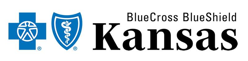
Our logo
Putting Kansas first
With our new design system, we’re going all-in on Kansas — focusing on our commitment to the health of our neighbors, our communities and our state. That’s why we’re flipping the hierarchy of our wordmark to lead with what truly sets us apart: our longstanding, local roots.
Our primary logo
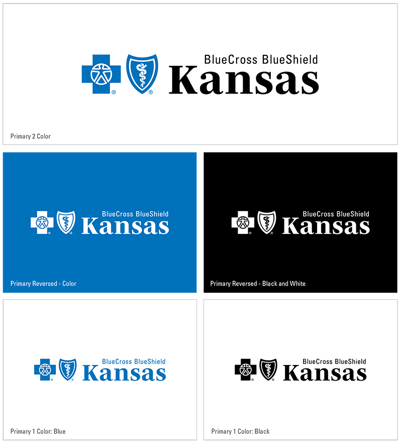
Our logo has two required elements: our symbols and our name. All internal and external Blue Cross branded marketing communications must use our logo and adhere to the following rules:
- The Signature may appear in a single, clearly defined configuration only as shown in the accompanying examples.
- The logo must appear in a single, clearly defined configuration as shown in the accompanying examples.
- Never attempt to create your own version of the logo — ONLY use the officially prepared electronic logo artwork, which you can obtain from our logo library.
- The two-color logo must combine the symbols in Pantone® 300 (Blue Cross Blue) with the type in black. To account for printing limitations, the Blue Cross Blue Shield Association has developed three acceptable alternative treatments, shown in the examples.
- If Blue Cross Blue isn’t feasible, the appropriate process color build is acceptable.
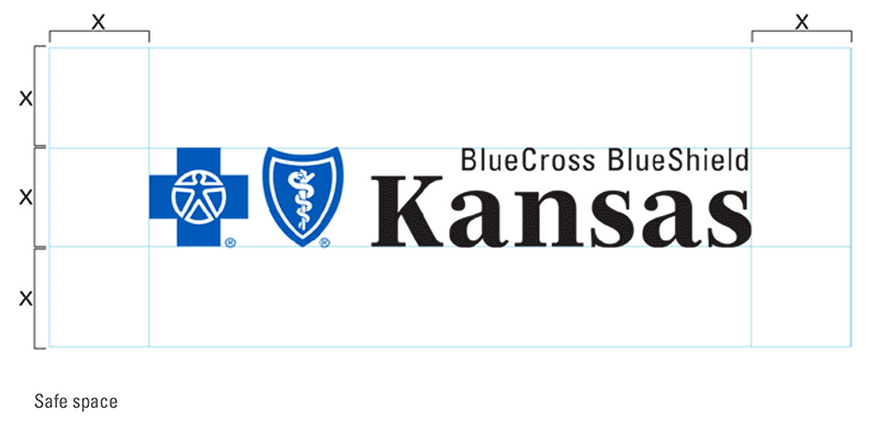
Clear space
Always separate the logo from accompanying text and graphic elements with a minimum specified amount of clear space. You can determine the minimum amount of clear space needed by measuring the height of the Blue Cross symbol in the logo, represented by X in the example.
Minimum size
The minimum logo size for the primary mark is two inches wide. This rule protects the legibility and recognizability of our mark. The logo at right is set to scale and can serve as a visual reference to check for accurate scaling.
For scenarios that may require a smaller logo, please see our secondary or tertiary logo.
Licensee disclosure
Licensee disclosure is also a Blue Cross Blue Shield Association legal requirement. The statement can be placed anywhere on the piece. The type must be at least 6 point in size and must remain legible and relatively independent of other copy or graphics. The statement shown here, must be included whenever the company name is mentioned.
"Blue Cross and Blue Shield of Kansas is an independent licensee of the Blue Cross Blue Shield Association."
A shorter version of this disclosure is available but it only allowed when another entity is not named within the piece. See additional detail regarding co-branding in the next section. For more information regarding the shorter statement, please contact our brand creative team by emailing [email protected]
"An independent licensee of the Blue Cross Blue Shield Association." ((Abbreviated version available for specific scenarios.))
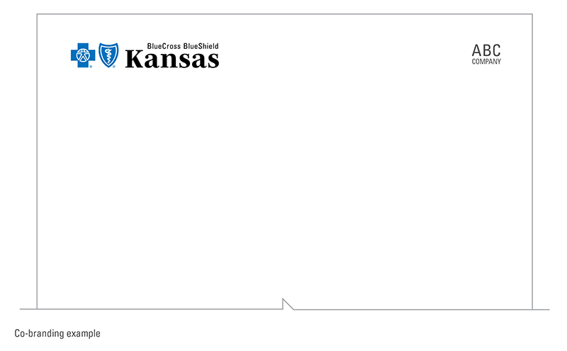
Co-branding
Co-branding is when the Blue Cross brand appears with another entity unrelated to our company. When co-branding occurs, a statement must appear with the full licensee disclosure that clearly explains the relationship that exists between Blue Cross and the other entity; for instance:
Blue Cross and Blue Shield of Kansas is an independent licensee of the Blue Cross Blue Shield Association.
BLUE CROSS®, BLUE SHIELD® and the Cross and Shield symbols are registered service marks of the Blue Cross Blue Shield Association, an association of independent Blue Cross and Blue Shield Plans. ABC Company provides vision services for our members and is not affiliated with Blue Cross and Blue Shield of Kansas.
In co-branding instances, the shortened or abbreviated licensee disclosures should not be used as mentioned above.
In addition to the disclosure, placement of the logos should be considered. The Blue Cross logo MUST appear more prominent than another entity’s logo. It should appear above or to the left of, and appear no smaller than, the other entity’s logo.
Improper usage
The primary logo should never be altered, recreated or stretched in any way. This includes placing our mark on backgrounds that hinder legibility or distort perception of the Blue Cross and Blue Shield of Kansas brand. Below are some examples of incorrect uses of the logo.
If you have questions regarding proper logo usage, please contact our brand creative team by emailing [email protected]

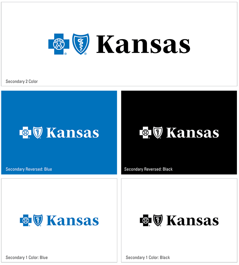
Our secondary logo
In scenarios that may not require our full wordmark, use the secondary logo.
Use the secondary logo if:
- The accompanying text reading ‘BlueCross BlueShield” may be illegible at scale. Examples include digital executions or out-of-home billboards
- The mark will appear on a screen for less than two seconds
- The primary mark appears elsewhere on the same piece of collateral
Adjustments
While similar to our primary logo, the secondary mark has some distinct differences that are worth noting:
- The size of the word ‘Kansas’ is increased while the size of the Cross and Shield symbols remains the same.
- The word ‘Kansas’ horizontally aligns with the internal shapes of the symbols.
- The overall mark is wider.
The safe space rules for the primary logo also apply to the secondary logo and licensee disclosure is still required.
Usage
Minimum Size
With the removal of the text "Blue Cross Blue Shield" the secondary logo allows to decrease the scale below the minimum setting for the primary logo. To maintain legibility of the secondary mark, the minimum height allowed is .25 inches.
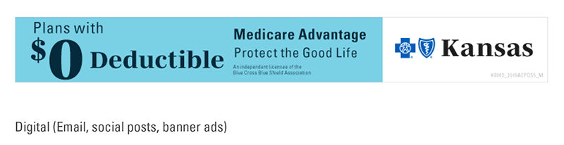
Digital
Use of the secondary logo may improve comprehension and legibility in digital spaces when compared to the primary logo. It is suitable for use when time is limited (social posts) or the audience is aware that it is our brand conveying the message (email).
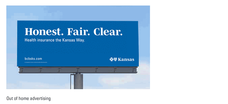
Out Of Home
Due to the nature of how our audiences experience these placements, quick and concise comprehension is paramount. The secondary logo is our preferred mark when creating out of home advertising.
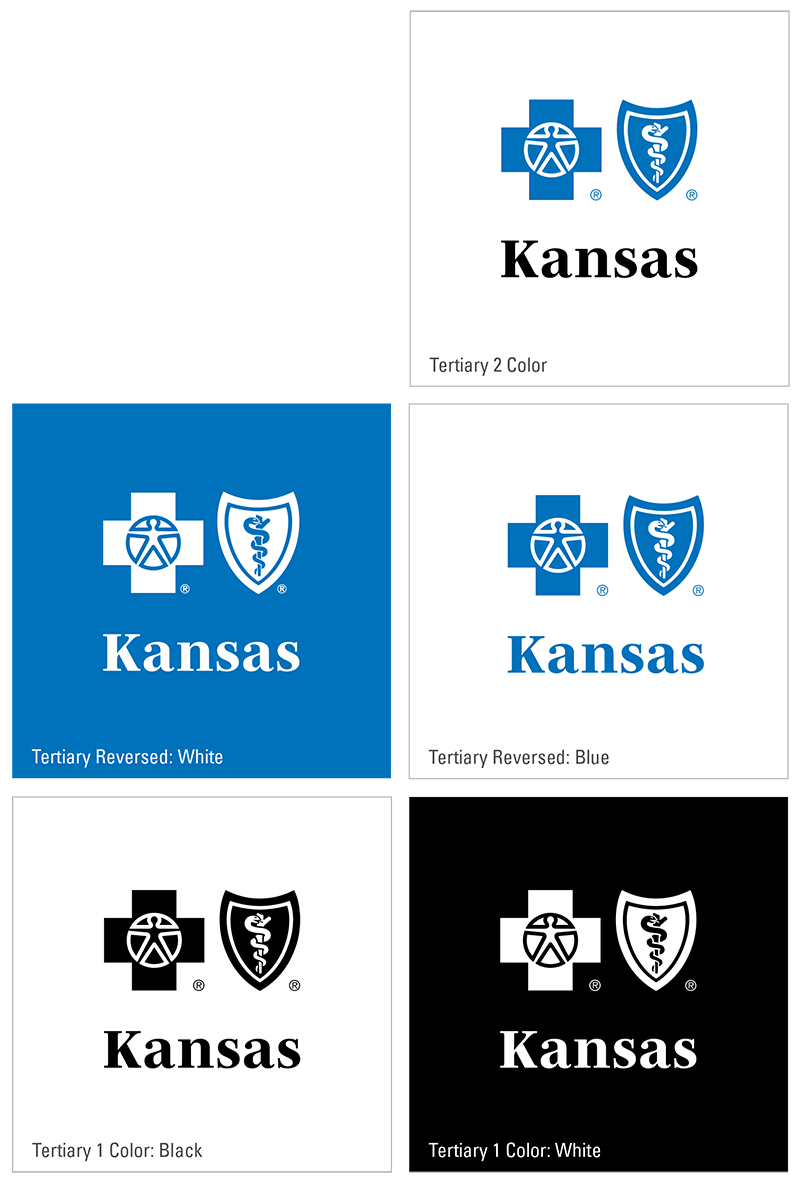
Our tertiary logo
Some scenarios may be limited horizontally, for these cases utilize the stacked, tertiary logo.
To use the tertiary Blue Cross and Blue Shield of Kansas logo the following scenarios must apply:
- The horizontal space allowed for the logo is limited
- The accompanying text reading ‘BlueCross BlueShield” may be illegible at scale or available time to read the text. Examples include digital executions or out of home billboards
- The mark will appear on a screen for less than 2 seconds
- The primary mark appears elsewhere on the same piece of collateral
Usage
Two Color
For the closest visual connection to our core logo, utilize the two-color version as the preferred version of the tertiary mark.
Minimum Size
With the removal of the text ‘Blue Cross Blue Shield’ the secondary logo allows to decrease the scale below the minimum setting for the primary logo. To maintain legibility of the tertiary mark, the minimum width allowed is 1 inch.
Promotion & Apparel
The secondary and tertiary logos are great options for promotional items and apparel. The simplified marks can allow for increased legibility on embroidered applications, cylindrical items (water bottles, pens) or scenarios where horizontal space is limited.
For more information regarding the tertiary logo, please contact our brand creative team by emailing [email protected]
Our colors
Colors are the essence of a brand, and our colors are an ode to Kansas. They reflect the warmth and openness of its landscape and the brightness we hope to bring to the people we serve.
DOWNLOAD .ASE COLOR FILES (CMYK)
DOWNLOAD .ASE COLOR FILES (RGB)
DOWNLOAD .ASE COLOR FILES (SOLIDS)
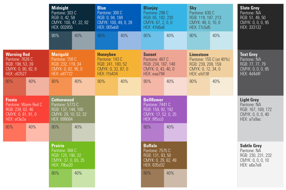
Note: Warning Red is a utility color. It should only be used to illustrate cautionary information or negative numbers. It is not considered a primary or secondary brand color.
Bellflower
Pantone: 7441 C
RGB: 159 92 192
CMYK: 17 52 0 25
Hex: #9f5cc0
Blue
Pantone: 300 C
RGB: 0 94 184
CMYK: 100 49 0 28
Hex: #005eb8
Bluejay
Pantone: 298 C
RGB: 65 182 230
CMYK: 67 2 0 0
Hex: #41b6e6
Buffalo
Pantone: 7575 C
RGB: 131 93 50
CMYK: 0 29 62 49
Hex: #835d32
Cottonwood
Pantone: 5773 C
RGB: 137 144 100
CMYK: 29 10 52 32
Hex: #899064
Fiesta
Pantone: Warm Red C
RGB: 239 62 46
CMYK: 0 91 91 0
Hex: #ef3e2e
Honeybee
Pantone: 143 C
RGB: 241 180 52
CMYK: 0 32 87 0
Hex: #f1b434
Limestone
Pantone: 155 C at 40% Tint
RGB: 239 209 159
CMYK: 0 12 34 0
Hex: #efd19f
Marigold
Pantone: 158 C
RGB: 232 119 34
CMYK: 0 62 95 0
Hex: #e87722
Midnight
Pantone: 303 C
RGB: 0 42 58
CMYK: 100 47 22 82
Hex: #002855
Prairie
Pantone: 368 C
RGB: 120 190 32
CMYK: 37 0 83 25
Hex: #78be20
Sky
Pantone: 630 C
RGB: 119 197 213
CMYK: 48 0 10 0
Hex: #77c5d5
Sunset
Pantone: 487 C
RGB: 234 167 148
CMYK: 0 43 40 0
Hex: #eaa794
Slate gray
RGB: 51 49 50
CMYK: 0 0 0 95
Hex: #333132
Text gray
RGB: 77 77 79
CMYK: 0 0 0 85
Hex: #4d4d4f
Light gray
RGB: 167 169 172
CMYK: 0 0 0 40
Hex: #a7a9ac
Subtle gray
RGB: 230 231 232
CMYK: 0 0 0 10
Hex: #e6e7e8
White space
RGB: 255 255 255
CMYK: 0 0 0 0
Hex: #ffffff
Warning red*
Pantone: 7626 C
RGB: 198 53 39
CMYK: 0 90 92 8
Hex: #c63527
*Warning Red is a utility color. It should only be used to illustrate cautionary information or negative numbers. It is not considered a primary or secondary brand color.
Color usage tips
- Try not to use more than three colors on your piece.
- When picking a color for a piece, pick one that complements the imagery.
- When used as a flood, Midnight Blue should be at 80% tint so that it doesn’t become too dark.
- Some projectors might not be equipped to project lighter colors in presentations, so avoid using Honeybee or Marigold for text.
- When using our colors for digital applications, please utilize a color contrast checker to ensure legibility. You can use the following contrast checker: https://webaim.org/resources/contrastchecker or one of your choice.
Grays usage tips
- Our logo utilizes 100% black.
- Instead of 100% black, use Text Gray for all text.
- Use Light Gray for patterns when multiplied over a light color.
- Use Subtle Gray for simple callouts within the design.
- Use White to intentionally work negative space into your layouts — this will keep the information easily digestible and in line with the idea of "Plain Talk."
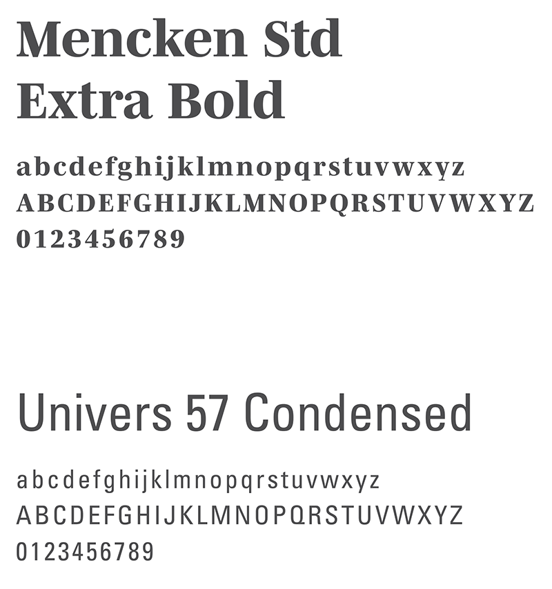
Our fonts
Part of The Kansas Way is incorporating a shift in tonality, and the language and typography we use are important signals of this shift. The typeface in our primary logo, when used alongside Univers, indicates a warmer, more personal approach.
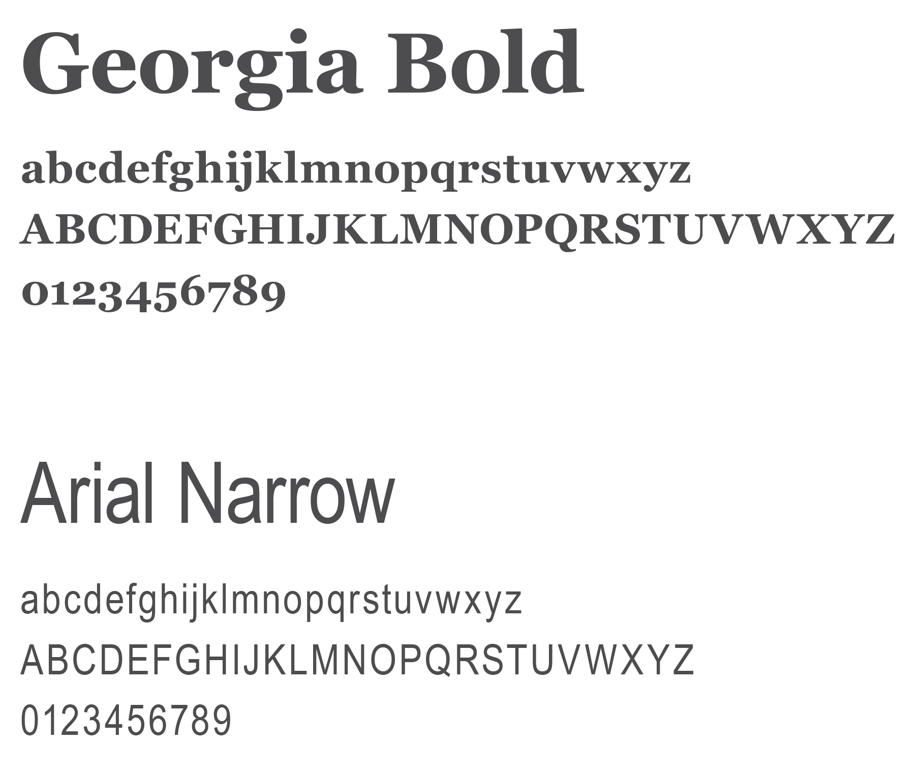
Our alternate fonts
In situations where our core brand fonts are not available, substitutions are acceptable to ensure our look and feel remain relative and consistent. These fonts are universally available and should be used for web-safe fonts, PowerPoint presentations and templates that require widespread access.
If you have questions regarding alternate fonts, please contact our brand creative team by emailing [email protected]
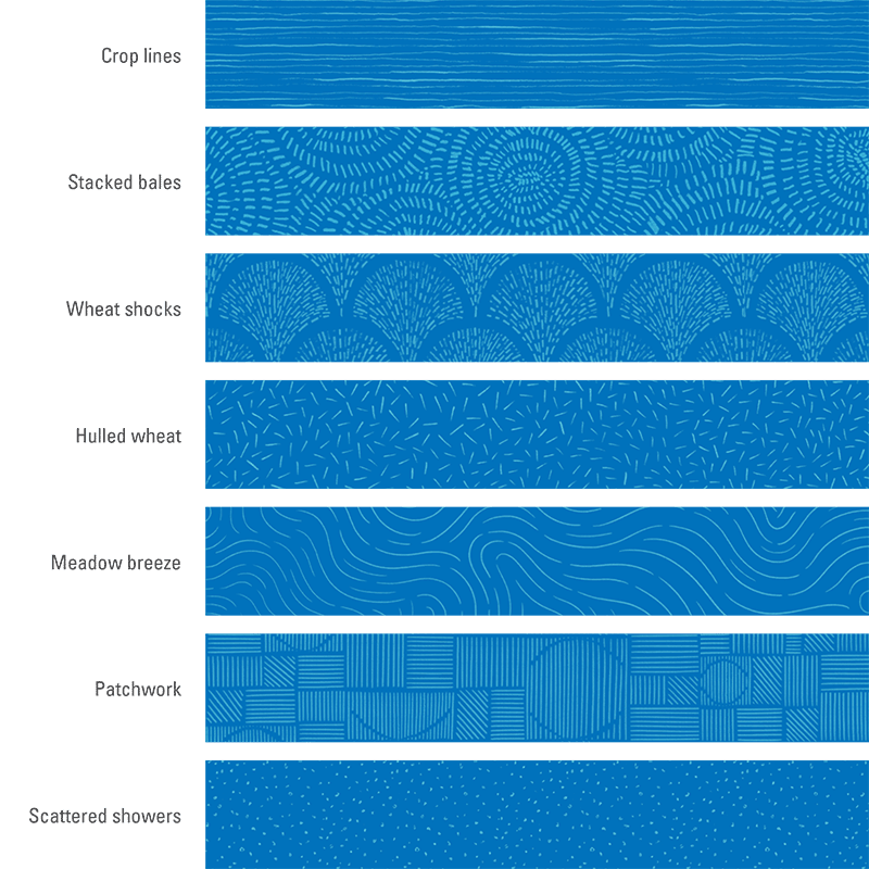
Our patterns
Our patterns are ownable to us. Inspired by the landscape of our state, they introduce a layer of warmth and bring in a human, handmade touch to our design.
Usage tips
- Patterns should be used as an accent to complement layouts.
- Patterns should help to create a layered design without overpowering any information.
- Be cognizant of cropping patterns so as not to leave small portions of patterns floating in layouts.
- Avoid placing patterns underneath body copy or over the subjects in photographs.
- Only use one pattern per page to ensure legibility and clarity.
- Opacity for each pattern should be set between 15 and 20%depending on the color, the complexity of the pattern and the overall layout.
- The pattern and its background should always be different shades of the same brand color. The following exceptions are permitted:
20% GRAY OVER BEIGE
SKY BLUE OVER BLUE
20% GRAY OVER SKY BLUE
Our imagery
We want our photography to highlight warm, honest moments and reflect life as it happens. Choose well-lit images with natural light. Subjects should appear relaxed, friendly and approachable. When possible, use photos of real members and avoid using stock photos or photos with low image quality.

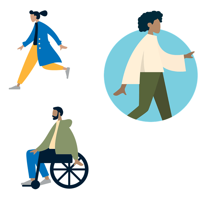
Our illustrations
Like our patterns, illustrations add a human, handmade touch — especially in situations when photography isn’t available or appropriate. With illustrations, less is more, so use them sparingly and intentionally.
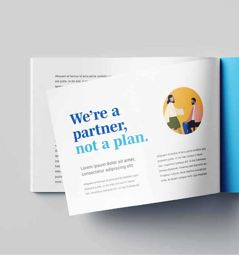
Usage tips
- Utilize the Kansas color palette to add warmth
- Show diversity
- Utilize one illustration per layout.
- If using a circle as a background element, the illustrations can extend beyond the borders of the circle.
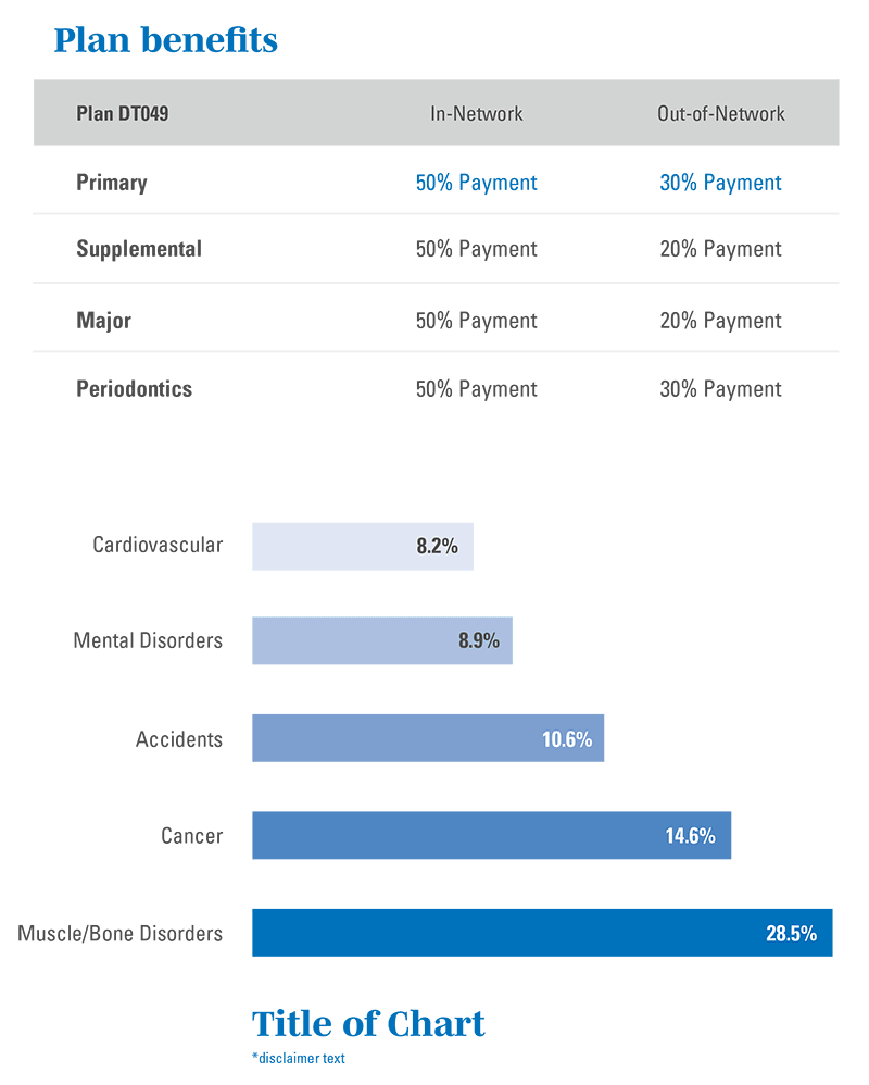
Our charts & graphs
When designing charts and graphs, remember that readability is key. Keep the layout simple and concise so the core information is clear and easily digestible.

Usage tips
- Use Mencken Std Extra Bold for titles or large callouts.
- Use Univers 57 and 67 for the rest of the text.
- Keep it simple by using our brand’s grays and blues.
- Utilize pops of color when you need to call out a specific piece of information.
- Tints of Blue should be based on percentages (100%, 70%, 50%, 30%, 10%) for 5 data points, above 5 points, use shades of gray.
- As callouts, percentage symbols should be superscript. In text or bar graphs, percentage symbols should be text height.
Bringing it all together
Usage tips
- The logo should always be easy to find
- Create structure with topic/line/URL
- Add color field with hierarchy in mind
- Emotion should lead, information follows
- Patterns should not overpower
Questions and approvals
If you have any questions, concerns or specific needs, please contact our brand creative team by emailing [email protected]